Messaggia con Ava - Il tuo consulente aziendale con IA
Ciao sono Ava, la guida con IA che darà la carica alla tua attività!
Se hai già un'attività o sogni di avviarne una, sono qui per aiutarti a realizzare la tua idea con l'aiuto di freelance supportati dall'IA. Condividi i tuoi obiettivi aziendali e insieme creeremo un progetto su cui i nostri talentuosi freelance potranno fare delle offerte. Dai vita alla tua idea!
Ho un'attività
Voglio avviare un'attività
Non è stato possibile inviare la conversazione alla tua email. Riprova più tardi per piacere.
Puoi salvare la tua conversazione al massimo ogni ora. Riprova più tardi per piacere.
La tua conversazione è troppo breve. Continua a discutere con Ava per abilitare il salvataggio.
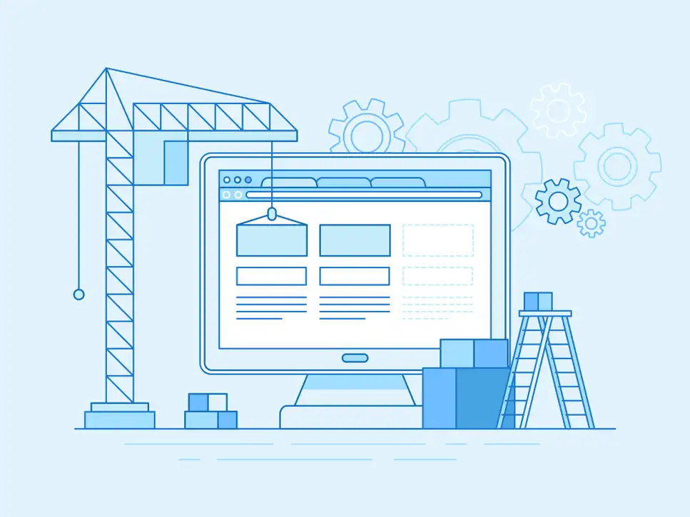
Ultimate guide to designing a beautiful website
Follow this guide to help you design a beautiful website your visitors will love
6 dic 2019 • Lettura di 14 minuti
Aggiornato il 13 gen 2020 da Closed User
E
Closed User
Impossibile copiare negli appunti. Riprova dopo aver modificato le tue autorizzazioni.
Copiato negli appunti.
Need help designing your website? Follow this guide
As the market continues to flood with shiny new products, the standard for beautiful design is continuously raised. It's now harder than ever to impress customers, so if your website lacks aesthetic appeal, nobody will convert to your offering.
This guide will help both beginners and seasoned web creators incorporate the most effective design practices into a beautiful website design.
This is part 4 of our website creation series. To navigate to any of the other chapters, refer to the contents list below.
Now get your painting shirt on and let's start designing!
What do website visitors actually want?
All of your web design efforts should be guided by the following principle:
You are NOT designing your website to please yourself, you are designing it for your visitors.
With your customer persona's complete you should have an understanding of the specific people you will be designing your website for. But this knowledge isn't enough, you need to also understand the mindset of the visitors perusing your website.
The typical customer buying journey is comprised of 4 phases:

According to the graphic above, visitors need to be interested in a website's content before they convert, and in order to become interested in something, you need to extinguish every reason to be skeptical of it.
So your visitors are likely to feel skeptical when they first land on your web page.
This understanding is vital because if you design your website to quell all skepticism first, you will be challenging the majority mindset of visitors and significantly increasing your chances of conversions.
Skeptical visitors are looking for a reason to bounce off your page, so you need to give them what they want fast!
Each visitor wants the following basic questions answered (we'll teach you how to answer them effectively in the next chapter):
1) What does this business do?
2) Why should I choose them / what makes them different?
3) How can I contact them with my unique questions?
4) How can I convert?
The most successful websites seamlessly guide visitors to each answer without interruption using a very powerful design strategy called UX design.
What is UX design?
User experience design (or UX design) is the process of manipulating user behavior without any cognitive effort. So in other words, users shouldn't need to think about the actions you would like them to take.
A great user experience is one that helps users locate what they need in as little time as possible with as few actions as possible.
Now let's break down some of the most effective UX design tactics so that you can incorporate them into your website.
UX best practices: web logo placement
Your logo you created in your brand identity project should be displayed on every page of your website. This prevents visitors from thinking they are being forwarded to another website whenever they click on a link.
The placement of your logo is very important, it should be located on the top left of each page. The reason for this is that in the western world we read from left to right and top to bottom, also known as the Gutenberg Rule.

This L shaped reading convention should guide the placement of all your website content. The most important information should be aligned to the left and the less important to the right.
Here are some examples of websites following this logo placement convention:


Top left logo placement - Source: kawasaki.com
Because of their inverse reading pattern, websites in the eatern world, display their logo in the top right corner:

UX best practices: website menu placement
Think of your website menu as your website's 'remote control'. They should be able to switch over to any page of your website at any time. So, your website menu should be visible at the top of all your pages (also known as the header).

A great UX design tactic is to capitalise upon this convenient location by making the menu "sticky." A sticky menu is always visible at the top of the web page as the user scrolls down the page.
Featured Work in Website Design

Clean Web Design - Desktop & Mobile
by ukroficer

Homepage Redesign
by JohnFLAG

Website User Interface
by bilgeberkay

Interior Studio Landing Page
by balasinski
To experience a live demonstration of a sticky header menu, check out veganuary.com .
Make sure you keep the information in your header menu to a minimum, you don't want to overwhelm your visitors with information like in the example below.

You should also include a menu in the footer of each web page like samsung.com :

This gives visitors the option of accessing fresh information when they scroll to the very bottom to keep their interest stimulated.
UX best practices: Website menu order
Menu items are one of the most commonly clicked regions of website, so it's important to subject them to the L shaped reading convention we spoke about earlier. The menu options should be ordered by level of interest to your visitors, with the most relevant towards the left and least relevant towards the right.
To help you map the interest hierarchy of your visitors, let's revisit the 4 primary questions visitors want answered on any website:
1) What does this business do?
2) Why should I choose them / what makes them different?
3) How can I contact them with my unique questions?
4) How can I convert?
Your website menu should aim to answer these questions in this order. To demonstrate how this is done, take a look at this example:

Let's take a look at how the menu in this example follows this ordering convention:
1) What does this business do?
This accounting firm lists all of their service pages in the first menu option.
2) Why should I choose them / what makes them different?
The second menu option navigates visitors to the 'team' page with a detailed outline of their unique offering.
This is followed by "tax resources" because this business has identified it as a primary requirement for their visitors.
This is why it is important to create detailed customer personas to understand the content your visitors are most interested in.
Design tip:
3) How can I contact them with my unique questions?
The contact menu option directs visitors to a contact form.
The "blog" menu option is located in the far right because it is the least likely to be clicked by visitors. It's a good idea to include it in your menu bar so that all of your web pages benefit from any individual SEO victories.
3) How can I convert?
If you include a call to action in your menu, position it towards the right to give your visitors an opportunity to quell their skepticism with the preceding content. Some examples of menu conversion titles are, "shop now", "buy now" or "order".
Should you use a drop down menu?
While drop down menus a very aesthetically appealing, they should be used cautiously. A needlessly long list of drop down menu options will frustrate your visitors and give them a reason to bounce off your page.
Negative experiences, no matter how small, have more of an impact on your visitors than positive ones.
The other downside to dropdown menus is they encourage visitors to skip over your primary pages and instead click on secondary pages. This is can be disruptive to your intended visitor journey.
In saying that, if you have a very large website with multiple categories, your visitors will appreciate all of the options consolidated by category in a drop down menu, since it will minimize their navigation time.

UX best practices: website hero image
The hero image of a website is a large and prominent visual element that captures a visitors attention first when they enter your website. It can either be a still image or a video. It is a highly effective UX design tactic which is why some of the biggest brands use them on their websites:
Apple.com

Tesla.com

microsoft.com

Hero elements instantly give your visitors a captivating experience which is important to achieve as early as possible (within 15 seconds in fact).
The hero image is also a great place to display calls to action buttons because the clean minimalistic design give visitors only one option - to click on them. It's a great UX design tactic of manipulating the initial step of the visitor journey.

Hero images are displayed 'above the fold', this is the area of a webpage most visitors focus on. The term was originally used for newspaper publications that would display the most important news stories above the area they were folded at.
The 'folded' portion of a web page consists of all the content that is visible on the page before you start scrolling down. This can be approximated as the height of content that fits in a standard laptop screen.

Some hero images extend all the way to the bottom of the screen. This minimizes the distraction of any other elements and makes the hero image more impactful.

A full sized hero image also encourages users to start scrolling down to discover more information.
Important:


Clean UX design
Clean designs are integral to effective UX. A clean web design is one that compresses information into small bite sized chunks and keeps them all separated with sufficient space.
Notice how this website spaces out all three clickable options:

This is a very important design principle because the more visually complex a website is, the longer it will take users to make a decision. The best method of manipulating a visitor's journey is by given them fewer navigation options.
For example, the designers of the St. Regis Venice Hotel website wanted visitors to continue scrolling down the web page to soak in all the beautiful imagery. This why there are no navigation buttons to skip over content. The only visitors have is to keep scrolling down the page.
The website for The Scott Resort only displays one button in each blade of content, so visitors only see one navigational option at any time.

Clean websites are really enjoyable to navigate and even have a calming effect on visitors. Messy websites, however, make visitors feel anxious. just take a look at this extreme example and judge your anxiety levels for yourself:

Besides their aesthetic (and mental) benefits, a clean design also helps your website rank higher in search engines.
Because clean web designs have less elements to load, they load much faster, which has a positive SEO effect .
If your website is already built, you can test it's loading speed for free here.
UX visual queues
UX visual queues are small but powerful guides that encourage visitors to follow an intended navigational journey. All the best website designs incorporate them, you have likely falling victim to them many times unknowingly.
Let's break down a few examples of them.
Scrolling direction
We mentioned earlier how full sized hero images can encourage visitors to keep scrolling down.
If you also add a strong visual indication of the direction of scrolling, your visitors will be compelled to discover the additional information below.


Image carousels
An image carousel is a way of displaying images across multiple pages. Each image is accessed by flicking across the screen.
If you have ever visited an online store you would have definitely come across an image carousel

The visual queue of the circle series picture above, indicate the presence of carousel which will entice the user to start scrolling to the right. Motivating the user flick to the right to see more images plays upon their curiosity which encourages them to remain on your page.
But image carousels should be used sparingly because humans are generally quite forgetful. When a user flicks through set of carousel images, each new slide replaces the memory of the previous one.
This is why image carousels should only be used to display product images and not textual information.
Freelance Website Design Experts

PHP
JavaScript
Website Design
Graphic Design
Logo Design

PHP
JavaScript
Photoshop
WordPress
Facebook Marketing

PHP
C Programming
Java
JavaScript
XML

PHP
C Programming
Visual Basic
.NET
Script Install
So whether you have an ecommerce store or you're in the real estate business, only use carousels to show your visitors different perspectives of the same visual product.
Use accordions to stack information
Accordions guide the user journey to each information segment through a subtle form of gamification. Gamification is the method of encouraging user activity through 'fun' actions. It's fun seeing an accordion expand and contract so t's a clever way of making boring clumps of information more engaging.

And because users have the option of keeping the accordion levels expanded, it mitigates the chances of memory loss.
You can even include links in your according boxes to relevant pages on your website for further reading.
Buttons
If you want your visitors to click on your buttons, you should make them look like buttons.
A website button is characterised by a rectangular border with rounded edges.
The most important buttons, like your primary calls to action should be the largest on the page.
Just make sure you don't fill your web page with too many buttons, as professional UX designers, we are always striving to keep things clean and simple.
As an example, hero images usually contain 1 clickable button, but no more than 2.


In the bentleymotors.com motors example above, one of the buttons is colored. This is a subtitle tactic of highlighting the button you prefer your visitors to click. You could use the dominant color of your brand identity's color scheme or a color users are psychologically inclined to click on.
Users are most likely to click on orange, yellow, and blue buttons.
These colors correspond with energy, optimism and trust respectfully, so it's no surprise why users enjoy clicking on them.

Web form buttons
Webforms should be designed to be completed as quickly as possible because they have a higher chance of abandonment, the internet could cut our or the visitor could just lose interest.
Web form buttons should therefore be placed inline with the navigational path of the user, even if it breaks the Gutenberg Rule.
For example, instead of having the user navigate all the way to the right to click "OK" after completing the form, it's much more convenient for the button to be placed closer to the last form field and inline with the user navigation flow.

Sometimes it's best to place buttons on the far left of a form especially if all of the field options are aligned to the left:

Buttons can also be used on web content to emphasize primary and secondary functions. In this example, the colored button highlights the preferred function of the user and the less prominent link the secondary action.

This strategy is often used in exit pop ups to encourage visitors to click a button for further engagement, rather than decline via the link text:

Button ordering - Yes/No
Yes and no button options follow the same conventions as every day appliances. Positive options like 'yes' and 'on' are always displayed to the left of their opposites.

Social media for UX design inspiration
If you ever need instant inspiration for effective UX designs, simply reach into your pocket and pull out your phone.
Social media platforms set the standards for most UX design principles because their users
become so accustomed to them.
Let's take a look at some examples:
Instagram UX examples
Instagram example 1:

Source: Instagram app
The button at the bottom encourages users to view similar content. The color blue makes it trustworthy and the rounded edges of this button make it less 'abrasive' and more welcoming.
How can you use this UX design strategy?
Because instagram users are clicking on this button multiple times a day, they are likely to click it on your website if you use the same color and shape.
Instagram example 2:

Source: Instagram app
In this example, not a single word is used to represent each of the menu options, only icons. This makes the entire page look more clean and ordered.
These icons also also set a new standard of graphical representation. The three dots in the top right hand corner has now become a well known symbol for 'view more options'.
Featured Work in Website Design

Website Design for a Design Agency
by shahinaakhter

E-commerce Website Design
by pilipenko2001

Renault Website Design
by negar72

Homepage Mockup - Life Insurance Co.
by webninjaz
Also notice how the picture does not cover the entire height of the page. This makes the content seem less overwhelming and, again, more 'clean'.
How can you use this UX design strategy?
If your web design starts looking too messy, consider representing worded menus with icons and leaving white space around graphical elements.
TikTok UX examples
TikTok is new to the scene which means they have some fresh UX design strategies we can learn from.
Tiktok example 1

This is the 'discover' page. All of the videos are arranged in a carousel and each individual video thumbnail is a short preview of the video. This provides a great user experience because users can decide whether a video is worth watching before even clicking on it, which prevents frustrating back and forth navigation.
And because multiple thumbnails are visible across the screen, the user can watch up to 9 previews before finally selecting one to watch, which minimises the navigational journey even further!
How can you use this UX design strategy?
If you offer multiple services or sell multiple products on your website, consider making as many of the options visible as possible.
Tiktok example 2
TikTok does not want to disrupt the video viewing experience, so their menus are designed to cover as little of the video as possible:

How can you use this UX design strategy?
If you know that your visitors will be engaged with a particular element, do not disrupt their engagement with overlapping content.
Linkedin UX example
Linkedin is a professional social network so, so their UX design tactics are less on the gimmicky side and more focused on functionality.
If you have been reading up until this point, you should be able to identify the 4 different UX tactics in the example below:

1) Backwards button icon direct user journey.
2) Universal 'search' icon used instead of a worded label.
3) Blue button color highlights the intended user action, and it's blue to instil trust.
3) 4 dots indicate there are more menu options to follow
An impressive way Linkedin keeps users notified of their navigational progress is by swiping each new view rather than statically refreshing it.
Whenever a clicks on a link to progress their navigation, the new screen swipe in from right to left.
When the user clicks 'back' the screen refresh direction is reversed, from left to right. Notice how this follows the western world's reading convention.
Now let's discuss how you should structure your website text to help visitors digest it most efficiently.
Structuring website textual content
Single column of text.
Visitors expect to keep scrolling down a website to see more information. To meet this expectation, you should avoid having more than a single column of text.

Keep all content aligned
This doesn't just annoy the hyper-obsessed, all visitors feel angst when they see misaligned web content. If a visitor finds anything even slightly annoying on your website, they will leave.


Make sure the vertical spacing between elements is also consistent:

Follow a visual hierarchy
Use headlines to separate topics. Your headlines must be displayed in a larger font (H2 or H3) to further emphasis this separation. Breaking down your content into bite sized chunks like this make is much easier to read and, therefore, understand.

Conclusion
If you want to impress your visitors with your website design, focus on giving them what they want as fast as possible and with minimal effort. Follow the guidelines in this article to create a beautiful website that accurately reflects the prestige of your business.
In part 5 of our guide, we will teach you how to SEO optimise your website content so that it ranks on the first page on Google.
Dicci di cosa hai bisogno
Inserisci il nome del tuo progetto
Storie correlate


Parla con uno dei nostri assistenti tecnici che ti aiuterà con il tuo progetto
Articoli consigliati per te
Great graphic design will solidify your brand identity and drive revenue. Find out how to hire a great designer and what you should expect to pay.
9 min read

If you want your brand to stand apart from the crowd, or if you want to be at the cutting edge of graphic design, add these trends to your repertoire.
6 min read
Web design is a unique beast in the field of graphic design, so you'll need some unique tools. We've found the 7 best web design tools you need.
3 min read

If you want to stay competitive in 2021, you need a high quality website. Learn how to hire the best possible web developer for your business fast.
11 min read
Grazie! Ti abbiamo inviato tramite email il link per richiedere il tuo bonus gratuito.
Non è stato possibile inviarti l'email. Riprova per piacere.
Impossibile copiare negli appunti. Riprova dopo aver modificato le tue autorizzazioni.
Copiato negli appunti.
Caricamento anteprima
Autorizzazione per la geolocalizzazione concessa.
La tua sessione è scaduta ed è stato effettuato il log out. Accedi nuovamente per piacere.