Logo update

  • Stato: Closed
  • Premio: $60
  • Proposte ricevute: 49
  • Vincitore: nazish123123123

Descrizione del concorso

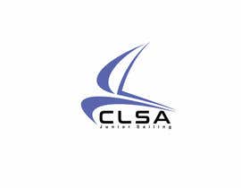
The attached logo is about 60 years old and needs help. This is for a small sailing club on a small inland lake (little boats with no motor).

The name is Cowan Lake Sailing Association (CLSA) but the updated logo is for the youth sailing. So Cowan Lake Sailing Association Junior Sailing or CLSA Junior Sailing.

On the original the C and L are supposed to be sails but not everyone understands that. The children sail small boats and often by themselves. I'd like the logo to be fun with some movement but should be simple and clean.

It does not need to be in a pennant shape but will get used that way sometimes. The logo will go on t-shirts and things like that. The current colors are okay but I am open to suggestions.

I'd like vector, png and jpeg files.

Thank you!

Competenze consigliate

Feedback del Datore di Lavoro

“Nazish123123123 is very professional. He understood the project made quick adjustments. I would work with him again and highly recommend this talented designer. ”

Immagine del profilo PLawrence4, United States.

Bacheca pubblica per chiarimenti

  • WafeN
    WafeN
    • 8 anni fa

    Kindly check 59, thank you :)

    • 8 anni fa
  • artedigitale85
    artedigitale85
    • 8 anni fa

    #45 thanks

    • 8 anni fa
  • PLawrence4
    Titolare del Concorso
    • 8 anni fa

    Or no figures is just fine too.

    • 8 anni fa
  • PLawrence4
    Titolare del Concorso
    • 8 anni fa

    Thanks everyone. I like the stick figure, but not the figures that look like a child. Its not quite who we are and so would be better to have fun with stick figures.

    • 8 anni fa
  • llewlyngrant
    llewlyngrant
    • 8 anni fa

    Please check #38 , #39 , #40 and #41 . Many thanks..

    • 8 anni fa
  • PLawrence4
    Titolare del Concorso
    • 8 anni fa

    the website is http://v2.clsa.us/wp/. There are 6-8 boats boat types in the pictures and I don't want the logo to look like any of them but it gives the feel of the boats. Something simple is good.

    • 8 anni fa
    1. GururDesign
      GururDesign
      • 8 anni fa

      Check #32 #33 #34 #35

      • 8 anni fa
  • artedigitale85
    artedigitale85
    • 8 anni fa

    #17 thanks

    • 8 anni fa
  • PLawrence4
    Titolare del Concorso
    • 8 anni fa

    Thanks everyone. I want to be sure the baot does not look like clip art. And I would like the old logo to be modernized.

    • 8 anni fa
    1. artedigitale85
      artedigitale85
      • 8 anni fa

      #1 thanks for check

      • 8 anni fa
  • llewlyngrant
    llewlyngrant
    • 8 anni fa

    Please check #3 , #4 , #5 and #6 . Many thanks..

    • 8 anni fa

Mostra altri commenti

Come iniziare a usare i concorsi

  • Pubblica il tuo concorso

    Pubblica il tuo concorso Con facilità e in pochi istanti

  • Ottieni tante proposte

    Ottieni una Miriade di Proposte Da tutto il mondo

  • Seleziona la proposta migliore

    Seleziona la proposta migliore Scarica i file - Facile!

Pubblica subito un concorso o unisciti a noi oggi stesso!