Logo Design Speed

  • Stato: Closed
  • Premio: $200
  • Proposte ricevute: 12
  • Vincitore: krsnov23

Descrizione del concorso

I want my logo fixed fast. The quicker the logos arrive, the more likely you will be chosen. This is a tester job for an eventual bigger job that will gauge the quality of work under time restrictions and one candidate will receive the reward but I'll also have seen other work for everyone and I could hopefully collaborate later on.

NOTE: I will REJECT immediately; posts that deviate from the brief, those that don't use my logo as a reference, or the elements and style from the style-elemts.jpeg picture attached below. CHECK THE FILES before working.

BRIEF

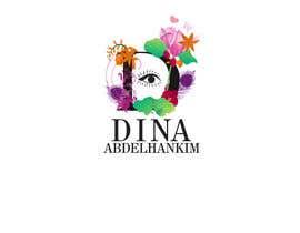
Included: Two Attached Files. One is the Logo-Concept which is my design that the work needs to be based on. The Style-Elements picture has the colors, elements, style, and theme to replace the elements on my logo.

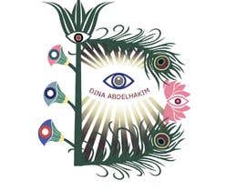
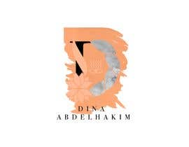
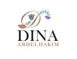
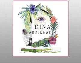
IMPORTANT1: The logo is still a Letter D with layered elements, but with the thematic elements from https://www.freelancer.com/fs/download-api.php?type=contest&id=1448033&filename=Style-Elements.jpeg

IMPORTANT: The style-elements image attached is a perfect reference to the type of elements that should be looking like, and used. Eyes, Roses, Lotus Plants, Lotus plants with eyes, peacock feathers with eyes, plants similar to the ones in the pic, colors and design feel as well.

They need to have 3 main differences:-

1- The plants and leaves need to be less tropical and more like Lotus, Orchids, and mandala styling elements, with eyes built into the elements. Like Style-Elements.jpg attaches.
2- It should flow better and not be as crowded. Smart Layering.
3- The word Dina Abdelhakim in the middle should be under the D logo symbol in one line. NO SCRIPT CURVY FONTS. Select a Serif or Sans Serif font you feel matches.

Deliverables:
- Logo AI, Editable PDF, EPS File(s) i.e. Source File to inspect layers and skill.

GO GO GO!

Competenze consigliate

Feedback del Datore di Lavoro

“Khaleem is a hard working person, came back with many changes and very fast. I would recommend”

Immagine del profilo omarei, Egypt.

Le migliori proposte per questo concorso

Visualizza altre proposte

Bacheca pubblica per chiarimenti

  • anandgaurav311
    anandgaurav311
    • 5 anni fa

    Sir i am just finish my design but winner has been chosen but still i want to share my design with you i hope you like it please message me then i can show my design .

    • 5 anni fa
  • winencarnado
    winencarnado
    • 5 anni fa

    I was still working on this but its a good thing I havent submitted my hand drawn work. Its disappointing, this should have been a copy&paste contest.

    • 5 anni fa
  • pcastrodelacruz
    pcastrodelacruz
    • 5 anni fa

    Award-winning design is not valid to use as a logo, it looks like a picture made with watercolor

    • 5 anni fa
  • sultana10safa
    sultana10safa
    • 5 anni fa

    please check#66#67

    • 5 anni fa
  • shahinnajafi7291
    shahinnajafi7291
    • 5 anni fa

    #41 check

    • 5 anni fa
    1. omarei
      Titolare del Concorso
      • 5 anni fa

      Best one so far, still not on brief unfortunately enough to be accepted

      • 5 anni fa
  • omarei
    Titolare del Concorso
    • 5 anni fa

    PLEASE NOTE THIS IS NOT A PROJECT TO CHANGE THE LOGO IDEA. THE LETTER D surrounded by elements that you can find in the style-elements jpg image I attached. LOTUS FLOWERS, ORCHIDS, EYES EMBEDDED IN THE DESIGN, PEACOCK FEATHERS, LEAVES. With a flat drawn authentic feel

    • 5 anni fa
    1. Rodrogo
      Rodrogo
      • 5 anni fa

      You want a logo or an art to decide ...

      • 5 anni fa
  • shahinnajafi7291
    shahinnajafi7291
    • 5 anni fa

    logo name?

    • 5 anni fa
  • yogendrakushwah3
    yogendrakushwah3
    • 5 anni fa

    HELLO SIR

    • 5 anni fa
  • omarei
    Titolare del Concorso
    • 5 anni fa

    NO MOCKUPS!

    • 5 anni fa
  • omarei
    Titolare del Concorso
    • 5 anni fa

    BEFORE SUBMITTING: Please use the Logo concept I made as a reference point, i.e. the letter D overlayed and underlayed with elements, colors and style from the Style-Elements jpeg

    • 5 anni fa
    1. junkmailhater
      junkmailhater
      • 5 anni fa

      hmm....it was less orienting to the eyes....saw that now....will send u a corrected version

      • 5 anni fa
  • macihai
    macihai
    • 5 anni fa

    Thank you for including that! It helps a lot, i appreciate it!

    • 5 anni fa
    1. omarei
      Titolare del Concorso
      • 5 anni fa

      No problem, but the design is very messy and has many different elements that dont match consistenly with each other

      • 5 anni fa
  • omarei
    Titolare del Concorso
    • 5 anni fa

    Please Use the Style-Elements.jpg as your guide to look, feel, usable elements, color guide, etc. It is like cloning elements from that picture for the logo.

    • 5 anni fa

Mostra altri commenti

Come iniziare a usare i concorsi

  • Pubblica il tuo concorso

    Pubblica il tuo concorso Con facilità e in pochi istanti

  • Ottieni tante proposte

    Ottieni una Miriade di Proposte Da tutto il mondo

  • Seleziona la proposta migliore

    Seleziona la proposta migliore Scarica i file - Facile!

Pubblica subito un concorso o unisciti a noi oggi stesso!