Design an App Icon and Logo for an elegant and easy-to-use encrypted chat app

  • Stato: Closed
  • Premio: $150
  • Proposte ricevute: 49
  • Vincitore: GabrielStanciu

Descrizione del concorso

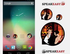
We need a mobile app icon for our elegant, easy to use, but encrypted chat/instant messaging app, which is called Speakeasy.

We also need a logo, which would probably be very similar to the app icon, but also is accompanied by the text "Speakeasy". The logo would primarily be used as a banner on our website.

We want the design to have the following properties:
- The cool of a 1920s speakeasy.
- It should imply communication.
- Convey a safe place to chat, away from eavesdroppers,
- but NOT be too paranoid - i.e. we don't want our logo to be a lock icon.
- Be classy, NOT geeky.


The best idea that _we_ could come up with was the app icon being a red wax seal embossed on the back of an envelope (see attachment for an awfully-drawn
annotated draft). The embossed text and line art would not need to "jump out" at the viewer; it should be a little subtle. Perhaps the logo would then be the design that is embossed on the wax?

But we're not committed to this idea, and we'd love to see your alternative ideas too.

We'll happily provide feedback throughout the contest - publicly, unless you ask for private feedback.

MUST:
- Design an app icon, and a logo with associated text
- Be original work. no clipart.
- Supply us with the original Photoshop, Illustrator, GIMP, or Inkscape files (that we can edit and tweak later), as well as PDF and PNG formats.
- App icon should be 512x512 minimum (or vector), but must also look good when scaled smaller.

Competenze consigliate

Feedback del Datore di Lavoro

“@GabrielStanciu won the contest on 16 August 2013”

Immagine del profilo speakeasyapp, Australia.

Bacheca pubblica per chiarimenti

  • STARWINNER
    STARWINNER
    • 10 anni fa

    Dear CH,
    Please review #50 and #51 .. Thanks

    • 10 anni fa
  • subhamajumdar81
    subhamajumdar81
    • 10 anni fa

    Please check #47 , #48 and give me some feedback. Thank you.

    • 10 anni fa
  • yillibrown
    yillibrown
    • 10 anni fa

    hiiii sir, i have design three icon for you please have a look #42 entry and rate my design.

    Regards Yilli Brown

    • 10 anni fa
  • bajaikaroly
    bajaikaroly
    • 10 anni fa

    Kindly check my new one #41

    • 10 anni fa
  • borhanyousuf
    borhanyousuf
    • 10 anni fa

    submit some idea relevant your requirement for consideration.

    • 10 anni fa
  • ChandramouliS
    ChandramouliS
    • 10 anni fa

    Kindly review entry #31

    • 10 anni fa
  • SueKocian
    SueKocian
    • 10 anni fa

    Hi, please review my entry #30 thank you very much and have a nice day, kind regards, Sue.

    • 10 anni fa
  • speakeasyapp
    Titolare del Concorso
    • 10 anni fa

    Some info I gave in private feedback that is relevant to everyone:
    We chose the name "Speakeasy" because a) it's a place to talk to your friends, away from eavesdroppers, b) it's safe without being paranoid, and c) speakeasies are cool.
    So I would like the design in the middle to bring out the "communication" part of a speakeasy - it could do this by showing people talking to each other. Or it could do this in another way - a booth in a speakeasy might work. Or some other way!

    • 10 anni fa
  • speakeasyapp
    Titolare del Concorso
    • 10 anni fa

    #12 : The pair of chat balloons looks good. But it probably doesn't fit in with the speakeasy theme of our app, and they don't hint at encryption/privacy. Also the text next to the bubble looks familiar - like Skype's old logo? (which we don't want).

    • 10 anni fa
  • speakeasyapp
    Titolare del Concorso
    • 10 anni fa

    #18 : I don't see how this design is related to communication, the speakeasy theme, or security?

    • 10 anni fa
  • bajaikaroly
    bajaikaroly
    • 10 anni fa

    Kindly check and review entry #5

    • 10 anni fa
    1. bajaikaroly
      bajaikaroly
      • 10 anni fa

      Please review #13 I hope I'm starting to understand what do you want for middle design.

      • 10 anni fa
    2. speakeasyapp
      Titolare del Concorso
      • 10 anni fa

      #11 : really don't like the middle design, sorry! The extra text doesn't fit our theme.
      #13 : The middle design is your best yet - but I hope it's original (or will be made original). I'm not sure about the light grey you've used - it doesn't look like the design has been stamped into the wax. If you want to move away from a wax design, that's ok - but if you're using a wax seal I think it should look more like the design has been stamped into wax.

      • 10 anni fa
  • Balazoobaz
    Balazoobaz
    • 10 anni fa

    Contest Holder, Please guarantee the project to entice more freelancers to submit their work.

    • 10 anni fa
    1. speakeasyapp
      Titolare del Concorso
      • 10 anni fa

      Done!

      • 10 anni fa
  • WezH
    WezH
    • 10 anni fa

    Hi there, would you be able to give comments for changes on logo #1

    • 10 anni fa
    1. speakeasyapp
      Titolare del Concorso
      • 10 anni fa

      Oops, did so above rather than here!

      • 10 anni fa
  • speakeasyapp
    Titolare del Concorso
    • 10 anni fa

    #1 : There needs to be a design inside the centre of the seal.
    Maybe the image should be cropped so that the seal is bigger.
    The wax seal doesn't look very much like a wax seal - here are some real ones: http://content.artofmanliness.com/uploads//2013/02/seals.jpg

    • 10 anni fa
    1. speakeasyapp
      Titolare del Concorso
      • 10 anni fa

      #4 : This is much better. Love the bits of spilt wax on the envelope. It's OK that you didn't have text inside the seal.
      I don't really like the text on the envelope though. The app icon doesn't necessarily need to have the word "Speakeasy" in it. The logo still doesn't have anything to relate it to "a 1920s speakeasy" though - maybe the chat bubbles should be replaced by something speakeasy-related - I don't know.

      • 10 anni fa
  • ChandramouliS
    ChandramouliS
    • 10 anni fa

    Kindly review Entry #3

    • 10 anni fa
    1. speakeasyapp
      Titolare del Concorso
      • 10 anni fa

      The design inside the seal looks a little plain - maybe a more detailed line-art style for the inside would be appropriate?

      • 10 anni fa
  • javiernegrete
    javiernegrete
    • 10 anni fa

    Hello
    Would you rather go to a flat design since iOS 7 is coming out Fall?

    • 10 anni fa
    1. speakeasyapp
      Titolare del Concorso
      • 10 anni fa

      Hi, we're only targetting Android, so we're not looking for an iOS 7-style icon. We will tweak/redesign the logo separately if/when we target iOS.

      • 10 anni fa

Mostra altri commenti

Come iniziare a usare i concorsi

  • Pubblica il tuo concorso

    Pubblica il tuo concorso Con facilità e in pochi istanti

  • Ottieni tante proposte

    Ottieni una Miriade di Proposte Da tutto il mondo

  • Seleziona la proposta migliore

    Seleziona la proposta migliore Scarica i file - Facile!

Pubblica subito un concorso o unisciti a noi oggi stesso!