Freelance:
DianaNin
First draft
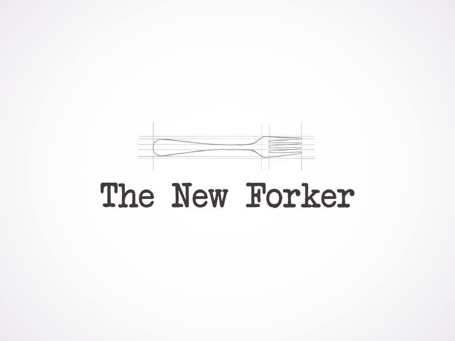
Hi! So this was my idea, regarding your logo. I drew the fork like that thinking that it would be a connection to the fact that you study architecure. It's still in the early stages of development :-), but first I wanted to see if you like the idea. As for the fonts, the first is a typewriter font (it seemed fitted to a blog), and the second is a bit more unusual. Please let me know what you think.


