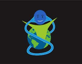
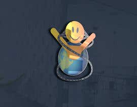
Design a LOGO for Synoida

  • Stato: Closed
  • Premio: $100
  • Proposte ricevute: 6
  • Vincitore: maani107

Descrizione del concorso

Synoida - The Together Way

Synoida is an emerging communications platform aiming to overhaul all human interaction for the better.

We need a new, novel, simple, easily recognizable icon in the shape of an S (for Synoida) that represents bi-directional, many-to-many, communication/exchange of understanding between humans.

--> the “S” should be the new icon
--> and "Synoida" in styled letters that works well with the icon’s S.
--> Space for a replaceable tagline should be incorporated into the logo design. Current tagline is “The Together Way”.
--> Font(s) used to be named in final submission.

It should be clear that a complete logo (icon + name + tagline) is required but that the competition will be judged primarily on how well the icon meets the brief above.

The “two way street” sample icon provided in the attached file ("synapplogo.png") is, for reference, a step in the right direction because of the simplicity, S shape and bidirectional traffic connotation, but doesn’t really convey communication (alt. understanding) and the statement it makes about the multi-point to multi-point is too weak.

The additional sample file ("Bad SynAppIcon 2.png") is maybe worth a mention for inspiration. It's a terrible graphic drawn by a rank amateur that looks like some kind of tapeworm or other parasite, but the idea could be useful. The symbology in that example is still a two-way street as in the first example, but one where each of the the two sides of the street looks like a "one-to-many" crow's foot such as used in database diagrams, but with people forming the crow's foot. The top can also be a ring of people holding the planet earth in their hands.

------------------ IMPORTANT UPDATE ------------------------
In a third attempt to clarify what type of real meaning we are looking for in the icon, we're attaching two additional pictures. In ("Crow's Foot ERD Notation.png") you'll find a quick explanation of relationship types from the world of database design (or Entity Relationship Diagrams). In ("Cool SynApp Icon Idea.png") the symbol for a many-to-many relationship had been shaped into an S to connect the world with itself through such a relationship. The relationship "lines" are also drawn to resemble a two-way street network.

----------------- MORE IMPORTANT GUIDANCE -----------------------
In the database modeling domain where the crow's foot was taken from, one of the (often ignored) rules is that entities should be named in the singular form, like Group and Member. That would read "One Group has many Members". Many-to-many relationships, even though they don't directly exist in relational databases, would also be modeled singular, like Region and Language.

Relationships in the ERD sense can also be self-referencing, meaning they look back from an entity onto the same entity. That is essentially what we're looking at in the Synoida logo as it has been developing, and in Synoida itself, making it perfect symbology.

All we need now, is to depict the Globe and the People in the singular. Still with different views of the world on either side of how the S goes over it. One world but also one person. Mankind. It would be really perfect symbology if the globe/world is also one person. In other words, The S-shaped many-to-many connector relates on the one side a globe or a world, and on the other side a person representing the sum total of all people. But those two sides are really two ways of looking at the same thing.

Competenze consigliate

Le migliori proposte per questo concorso

Visualizza altre proposte

Bacheca pubblica per chiarimenti

  • MarthinL
    Titolare del Concorso
    • 5 anni fa

    Copied from another design does not refer to the vectors, but to the concept. You know when you've taken an idea that wasn't your own. It doesn't require a sealed contest. It requires integrity. But then, I do see all entries and I can see who came up with what concepts first, so I will base my decisions about originality on the facts at hand. Understood?

    • 5 anni fa
    1. shelkeanmol
      shelkeanmol
      • 5 anni fa

      true !!

      • 5 anni fa
  • Artnaim99
    Artnaim99
    • 5 anni fa

    please check #157

    • 5 anni fa
  • MarthinL
    Titolare del Concorso
    • 5 anni fa

    It misses the point about how the many-to-many relationships are depicted. It looks cool, but the symbolism is more than a little lost in how you've drawn the roads.

    • 5 anni fa
  • MarthinL
    Titolare del Concorso
    • 5 anni fa

    Final hours. I'm very impressed with the work some has put into developing strong symbolism for the icon. Thank you. With other efforts, I was less impressed. Sorry about that, and thank you for those too. It takes all kinds.

    • 5 anni fa
    1. eemamhhasan
      eemamhhasan
      • 5 anni fa

      Doing the final work for you..!

      • 5 anni fa
    2. TEDesign48
      TEDesign48
      • 5 anni fa

      We are making a better one sir wait!

      • 5 anni fa
  • xetus
    xetus
    • 5 anni fa

    You've already rejected all good works. Stop spamming people.

    • 5 anni fa
    1. MarthinL
      Titolare del Concorso
      • 5 anni fa

      Spamming people? Rejected good works? You're way out of line there.

      • 5 anni fa
  • Samisaleem45
    Samisaleem45
    • 5 anni fa

    check #128

    • 5 anni fa
  • MarthinL
    Titolare del Concorso
    • 5 anni fa

    Hello Contestants. It's time for our daily update.

    Designs using the many-to-many crow's foot connector symbol have really been developing very nicely.

    It's time to start considering simplicity. "Less is more" The dots and people connected with lines are nice, but probably too much detail.

    Have a look at the —————— MORE IMPORTANT GUIDANCE —————————— update to the project description.

    Does it make sense? I hope so. Hey, nobody said this was going to be easy, did they?

    • 5 anni fa
  • Samisaleem45
    Samisaleem45
    • 5 anni fa

    check #127

    • 5 anni fa
  • Samisaleem45
    Samisaleem45
    • 5 anni fa

    check #122

    • 5 anni fa
  • Samisaleem45
    Samisaleem45
    • 5 anni fa

    please check entry #117

    • 5 anni fa
  • ronjames1928
    ronjames1928
    • 5 anni fa

    #97

    • 5 anni fa
    1. MarthinL
      Titolare del Concorso
      • 5 anni fa

      It's really pretty, but I fail to see the symbolism in the icon. Please re-check the brief.

      • 5 anni fa
  • MarthinL
    Titolare del Concorso
    • 5 anni fa

    Hello again contestants.

    Let it not be said we're stingy with ideas and ways to clarify that we're looking for. We've updated the contest brief (description) with another internally generated example illustrating how an S icon can be given meaning.

    Have fun seeing how you can develop that idea or come up with equally or even more meaningful ideas of your own.

    It's not only about a pretty looking picture, but also the symbolism and simplicity.

    • 5 anni fa
  • MarthinL
    Titolare del Concorso
    • 5 anni fa

    Good day Freelancers. We've been giving lots of feedback on your designs, and also rejected plenty. The most common reason for rejection is that the S graphics submitted has no no meaning beyond being an S (well, some wasn't even that).

    Synoida is a communication company, connecting many people to many people. Having a symbol that's disjointed will not meet the brief.

    In order to steer your creative minds a little and provide a better idea of what we mean with a symbol or visual metaphor, a (finitely not artistic) staffer has drawn up another sample icon for us. It looks terrible - like a dog's parasite - but if you can make it look better, it has some meaning to it. Check the updated contest description for more details.

    Kind Regards.
    Marthin Laubscher
    obo Synoida

    • 5 anni fa
  • silentlogo
    silentlogo
    • 5 anni fa

    please check my entry #42 #43

    • 5 anni fa
  • daniyalhussain96
    daniyalhussain96
    • 5 anni fa

    Please check entry #25

    • 5 anni fa
  • MarthinL
    Titolare del Concorso
    • 5 anni fa

    Reminder: The road icon is a sample of something that is simple and easily recognized as a metaphor for something bidirectional. As a metaphor it doesn't "say" anything about many-to-many communications and not a lot about communications.

    What we're looking for, is another, more powerful visual metaphor to use in the place of the two way street, or if it it can't be helped, then a logo that manages to squeeze more meaning into a simple S bend in a two-way street.

    • 5 anni fa
  • MarthinL
    Titolare del Concorso
    • 5 anni fa

    Title should have been clearer: WE NEED A LOGO.

    • 5 anni fa
    1. xetus
      xetus
      • 5 anni fa

      maybe You should add a cathegory : "Logo"?

      • 5 anni fa
  • deeds85
    deeds85
    • 5 anni fa

    #guaranteed #guaranteed

    • 5 anni fa
    1. MarthinL
      Titolare del Concorso
      • 5 anni fa

      Are you asking that I guarantee that somebody will make a design that meets the brief? How can I do that?

      • 5 anni fa

Mostra altri commenti

Come iniziare a usare i concorsi

  • Pubblica il tuo concorso

    Pubblica il tuo concorso Con facilità e in pochi istanti

  • Ottieni tante proposte

    Ottieni una Miriade di Proposte Da tutto il mondo

  • Seleziona la proposta migliore

    Seleziona la proposta migliore Scarica i file - Facile!

Pubblica subito un concorso o unisciti a noi oggi stesso!