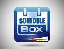
App Icon Design
- Stato: Closed
- Premio: $100
- Proposte ricevute: 135
- Vincitore: akshay090592

Descrizione del concorso
We provide online scheduling for professionals.
Competenze consigliate
Feedback del Datore di Lavoro
“Akshay was brilliant at coming up with creative designs that we would not have even thought of. I would definitely hire him again. He worked quickly to make any changes we suggested and delivered a final product we are very happy with.”
![]() segway, United States.
segway, United States.
Bacheca pubblica per chiarimenti
-

gazedge
- 11 anni fa
Looks interesting but i've seen a similar icon at the top apps
- 11 anni fa
-

Titolare del Concorso - 11 anni fa
I am waiting to hear back from some of my colleagues to help pick a winner. I will have the decision very soon...
- 11 anni fa
-
Brandonlj
- 11 anni fa
sounds good
- 11 anni fa
-
Brandonlj
- 11 anni fa
Check your personal messages, thanks.
- 11 anni fa
-

vishanything
- 11 anni fa
Please check your mail!
- 11 anni fa
-
Brandonlj
- 11 anni fa
- 11 anni fa
-
Brandonlj
- 11 anni fa
Is the paper I just submitted and improvement?
- 11 anni fa
-
Brandonlj
- 11 anni fa
Made the paper a bit wider: #138
- 11 anni fa
-
Titolare del Concorso - 11 anni fa
Thanks. the paper still isn't doing it for me. You can see the kind of paper i really like on #124
- 11 anni fa
-
vishanything
- 11 anni fa
Hi segway,
Please provide some feedbacks!- 11 anni fa
-
Titolare del Concorso - 11 anni fa
Here's some feedback: https://www.dropbox.com/s/qq2ngt3c23ikiwg/lighterBlue.mp4
- 11 anni fa
-
Brandonlj
- 11 anni fa
Please check #131 #132 #133 #134 . Thanks
- 11 anni fa
-
Brandonlj
- 11 anni fa
Hey segway,
Please provide any feedback you can. I hope to continue working on the icon for you, thanks!- 11 anni fa
-
Brandonlj
- 11 anni fa
Tell me what you think about the paper now, thanks.
- 11 anni fa
-
Brandonlj
- 11 anni fa
Look at #111 #112 #113 #114 #115 . Tell me what you think
- 11 anni fa
-
Cabdesigns
- 11 anni fa
Let me know if there's anything I can do to improve #108
- 11 anni fa
-
Titolare del Concorso - 11 anni fa
it's a great design. very creative and when I place it on the iPad or iPhone to see how it looks compared to other designs, the other designs attract the eye more.
- 11 anni fa
-
vishanything
- 11 anni fa
Please check #109 it reveals the pages more and the pages are distinct!
- 11 anni fa
-
vishanything
- 11 anni fa
also please have a look at #110 if it is any better!
- 11 anni fa
-
vishanything
- 11 anni fa
Hey segway, is there any scope of improvement in mine?
- 11 anni fa
-
Brandonlj
- 11 anni fa
Tell me if one of these are close to what you want: #96 #97 #98 #99 . I can always add the extra details later. Thanks for the great feedback and ideas
- 11 anni fa
Visualizza altri 3 messaggi
-
Titolare del Concorso - 11 anni fa
Maybe instead of having straight lines of paper, have some at slight angles. Your original paper design had some paper at angles. Also, entry #109 has pretty good paper. It is more clearly defined than yours. Yours being blurred out is ok but I think more clear is better if you can do that.
- 11 anni fa
-
Titolare del Concorso - 11 anni fa
My girlfriend said she liked the paper from #53 better in that it was more randomly placed in the box. I don't like the lines and checkered boxes of #53 but if you had more detailed lines like #109 on the paper and a mix of white and light grey coloured paper and possibly some paper curls that might be better.
- 11 anni fa
-
vishanything
- 11 anni fa
Please check #103 #104 and #105
- 11 anni fa
-
vishanything
- 11 anni fa
Thank you for an amazing feedback. I'm on it!
- 11 anni fa
-
Titolare del Concorso - 11 anni fa
I like the new version #110 but it doesn't show the logo well enough being so dark of a blue. I think a better change would be trying a lighter colour on the blue in #109 so it is not such a dark blue. It should still transition from darker blue to lighter blue at the top but start with a lighter blue at the bottom and go to an even lighter blue at the top. The paper looks great now!
- 11 anni fa
-
vishanything
- 11 anni fa
- 11 anni fa
-
Titolare del Concorso - 11 anni fa
#68 is better but I think the paper could be designed better. Maybe by not having colour, or arranging them differently or some other variation. #34 is also still great!
- 11 anni fa
-
vishanything
- 11 anni fa
Sure I'm on it... thanks for the feedback... always encouraging...!!
- 11 anni fa
-
Brandonlj
- 11 anni fa
Ok I thought of maybe doing something like this #90 #91
- 11 anni fa
-
Titolare del Concorso - 11 anni fa
Thanks for the revisions! I love the box, it is just gorgeous but it seems getting the paper to be equally fantastic is quite difficult.
Here's some thoughts I had on it: https://www.dropbox.com/s/4gp2sedx17fx85t/angledPaper.mp4
I think having just straight lines for the paper didn't look very good. I think having it look like pages where thrown in the box more naturally where they are not all lined up and straight would maybe look better.
Maybe even the front page would have a page curl on the top right corner... just a thought- 11 anni fa
-
Brandonlj
- 11 anni fa
Just adding some variation: #76 #77 #78
- 11 anni fa
-
Brandonlj
- 11 anni fa
Check out #62 and #63 . I know the paper can still use some improvement, but just to see if you like it with colored paper. Thanks,
Brandon- 11 anni fa
-
vishanything
- 11 anni fa
Please check out #64 #66 #67 #68 .
Vishanything- 11 anni fa
-

akshay090592
- 11 anni fa
#60 #61 Tried something completely different...its more illustrative...conveys the objective of the app in a much better way...hope you like it
- 11 anni fa
-
Brandonlj
- 11 anni fa
Hey segway, here are the updated images: #52 #53 #54 #55 . Thanks
- 11 anni fa
-
Titolare del Concorso - 11 anni fa
Awesome. Thanks for the updates. Here's some feedback: https://www.dropbox.com/s/z8bl1q2wg47pe6e/papers.mp4
- 11 anni fa
-
Brandonlj
- 11 anni fa
I've never had this much great feedback. Thanks, I will try to improve it, and the colored paper idea is a very good one.
- 11 anni fa
-
Cabdesigns
- 11 anni fa
Thanks for giving my design #37 4 stars. Are there any improvements I can make to it?
- 11 anni fa
-
Titolare del Concorso - 11 anni fa
Yes, I don't like the think outline around the icon. I think a thin outline would be perfect. Honestly I can't image how to improve it so it would be my top choice. I think it's a great design but not sure how to make it the perfect one... just my honest feedback.
- 11 anni fa
-
vishanything
- 11 anni fa
Hi Segway.... Please give a feedback for #56 and #57 as well....
- 11 anni fa
-
Brandonlj
- 11 anni fa
Please check out my latest entry #38 and provide feedback. Thanks
- 11 anni fa
-
Titolare del Concorso - 11 anni fa
awesome! I think I like this new one more than #33 . The only room for improvement that I see would be the papers inside. Not sure how i'd change them. maybe by putting more papers in the box, or making the pages look a little more distinct from each other (they all seem to blend together a little) & the marks on the pages may or may not be necessary. Not sur eif this feedback helps...
- 11 anni fa
-
Brandonlj
- 11 anni fa
Ok, I'll try to make the paper better. Thanks for the feedback, it's always great to have!
- 11 anni fa
Come iniziare a usare i concorsi
-

Pubblica il tuo concorso Con facilità e in pochi istanti
-

Ottieni una Miriade di Proposte Da tutto il mondo
-

Seleziona la proposta migliore Scarica i file - Facile!