Optimize a logo
- Stato: Closed
- Premio: $150
- Proposte ricevute: 32
- Vincitore: JubairAhamed1
Descrizione del concorso
I want to modernize our logo a tiny bit, flatten/simplify the text/remove gradient on the text-part of the logo and also get a high resolution version of the logo. See our old logo attached as logo_src.psd.
Primary target background: White / transparent
Primary target website logo size: About 60px heigth (max)
Primary location: See design of our NEW website attached, homepage.png.
Font: Century Gothic (or similar plain font that looks professional)
Colors: White, blue, gray (exactly like logo in homepage.png only in far better quality).
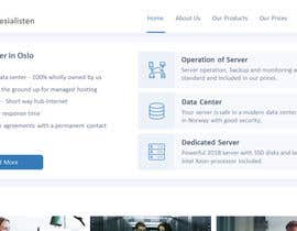
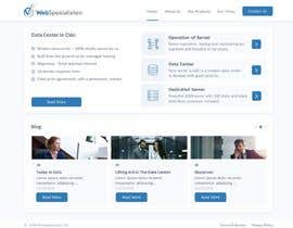
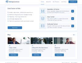
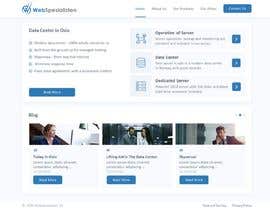
Try to make our new logo it similar to this and use homepage.png to show me the result of your logo:
https://kunde.webspesialisten.no/img/kunde.webspesialisten.no/logo.png
The logo will be mainly used at homepage.png attached, but it is also used on the link above here. The important place is homepage.png!
So create a fancy logo, put it on homepage.png and show it here. Main thing is white background and under 65px.
The colors and size between logo, text and text-lengt/heigth-ratio is close to perfect there.
Icon should be vertically centered on the text and keep space between
The logo must also work with a black and a blue background (similar to to how the blue in the text-logo part in "homepage.png" is. You may provide seperate images if needed (assume it is needed).
You can see where I want to use the new logo by looking at screenshot of "homepage.png" attached - our new website. I like the logo how it looks there on the screenshot, but it is just a bit bad quality because it has been changed from non-original source.
I have made an attempt here and I'm getting closer to what I want, but the W-icon is not as smooth as the original: https://kunde.webspesialisten.no. So I gave up.
The attached "homepage.png" has a "bug" in the bottom part in the icon-logo (the W-icon), in addition to beeing in bad quality and I have no high-quality version of it. But the size of things, colors etc. is correct direction and is better than the attached "logo_src.psd".
Attached is the original logo for our old website (https://webspesialisten.no), based on black background, layered in .psd and in high resolution "logo_src.psd". You will discover that the "W"-icon on front ot text is not change-able (not layered) and might need to be drawn again to deliver on this contest.
Contest-rules:
- Show approx 65px high version of the logo, preferable on the "homepage.png" design. Feel free to cut most of the page).
- Feel free to also show a big version of it as well here.
- I'm open to new design ideas around this, but my primary goal is to get something in the direction of what I got, in higher resolution and quality. So you migth waste your time if you do something very different.
Tips:
- Do not make the text to wide, the company name is long enough as it is.
- Do not make the "S" in WebSpesialisten bigger than it is. The normal way is Webspesialisten, but it looks better with a small difference like WebSpesialisten I think. Just don't make it bigger and do not add whitespace between Web and Spesialisten - again - it is one word.
Deliverable if you win:
- High quality, high resolution layered logo, with changeable text and colors in psd-format.
- Fav-icons/browser-icons.
- Any other source files that migth be good to have later (like if you draw something).
- Will also use the logo on Facebook.
Competenze consigliate
Feedback del Datore di Lavoro
“Did a very good design-job of our logo.”
![]() DeltaUser, Norway.
DeltaUser, Norway.
Le migliori proposte per questo concorso
-
JubairAhamed1 Bangladesh
-
JubairAhamed1 Bangladesh
-
leonardoluna1 Argentina
-
leonardoluna1 Argentina
-
JubairAhamed1 Bangladesh
-
JubairAhamed1 Bangladesh
-
JubairAhamed1 Bangladesh
-
pvdesigns Vietnam
-
leonardoluna1 Argentina
-
JubairAhamed1 Bangladesh
-
JubairAhamed1 Bangladesh
-
Mvstudio71 Bangladesh
-
monierul Bangladesh
-
Mvstudio71 Bangladesh
-
Mvstudio71 Bangladesh
-
imbikashsutradho Bangladesh
Bacheca pubblica per chiarimenti
Come iniziare a usare i concorsi
-

Pubblica il tuo concorso Con facilità e in pochi istanti
-

Ottieni una Miriade di Proposte Da tutto il mondo
-

Seleziona la proposta migliore Scarica i file - Facile!


