Mormon Vampire Lampoon
- Stato: Closed
- Premio: $290
- Proposte ricevute: 20
- Vincitore: Oniria

Descrizione del concorso
Book cover design wanted for Twilight lampoon, "My Boyfriend is a Mormon Vampire."
Competenze consigliate
Feedback del Datore di Lavoro
“Oniria's design won out over several very good designs because they understood my need was not for the best looking cover, but a cover that would convey excitement, parody, and humor. They tweaked the design as requested. After awarding the prize they continued to communicate to get my exacting specifications--7 small changes, and they threw in a few more of their own. ”
![]() greenjacketbooks, United States.
greenjacketbooks, United States.
Bacheca pubblica per chiarimenti
-

marATTACKs
- 12 anni fa
wow. congratulations to the winner then :)
I hope this book gets publish, sounds interesting.- 12 anni fa
-

Yutopia
- 12 anni fa
The advert will be : Don't Judge a Book by Its Cover xD
- 12 anni fa
-

JackKnight
- 12 anni fa
Right, please can I have the hours of my life back that I wasted on participating in this thing?
I understand contests are the new big thing on here, I was curious as to how the principle worked without shafting talented artists out of time and effort so I thought I'd get involved. Now I am wiser.
The answer is, it is entirely biased in favour of the client who can sit back and let dozens of struggling artists work their butts off in the vain hope of getting a couple of pennies. Now I know.- 12 anni fa
-
marATTACKs
- 12 anni fa
I know what you mean, its more like pitching designs... Although I get what you feel, I am not that regretful because I can always use my none-winning entries as samples in my portfolio. But yeah, its in favor of the client... oh well, thats life.
- 12 anni fa
-

AlphaPrime
- 12 anni fa
I would like to request feedback for #93 , but seeing the other submissions, I can say that this competition is going to be a close call. :)
- 12 anni fa
-

Titolare del Concorso - 12 anni fa
Good design. A few tweaks would have been necessary, and again, there is the challenge of conveying "parody."
- 12 anni fa
-
AlphaPrime
- 12 anni fa
Thank you, sir. I can say that tweaking is possible when we can collaborate on the parts that you see require fixing, but I can agree that "parody" is a big challenge to overcome.
- 12 anni fa
-
marATTACKs
- 12 anni fa
kindly check my new entry #80 :)
Thanks :)- 12 anni fa
Visualizza altri 5 messaggi
-
Yutopia
- 12 anni fa
I'm sorry but the franchise is not an insult. I did not say that my work was better than the 5 stars but there were who deserves much better for their very professional work and there are who do not deserve so much for there childish playground work. I hope that the winner can reflect the content of the book. and the contest holder is going to make the right choice.
- 12 anni fa
-
Yutopia
- 12 anni fa
good luck everyone... i prefer withdraw my works because i lack experience compare to the 5stars design. :)
- 12 anni fa
-

faizigenius
- 12 anni fa
Please check #91....I hope you will like this looking forward for feedback and ratings..Thanks
- 12 anni fa
-
faizigenius
- 12 anni fa
Please check #85 #88..I hope you will like this looking forward for feedback and ratings..Thanks
- 12 anni fa
-
marATTACKs
- 12 anni fa
Would you like cartoon-ish entries?
- 12 anni fa
-
seliname
- 12 anni fa
lol... it looks like there might be quite a few copyright infringements, here...
Images that have already been used for other things, pictures taken/made by other people, etc... are not stock images, guys!- 12 anni fa
-

Natch
- 12 anni fa
Hi! Could you give me a feedback #81, please. What i should improve? Thanks
- 12 anni fa
-
marATTACKs
- 12 anni fa
oh, I honestly thought its your artwork. I've seen that before, and I liked the style... so I was a bit of excited to find out if its yours :) If its not, I dont have a problem with that... you've actually put it nicely... but then again, it can be grounds for plagiarism...you might encounter problems in the future if the original artist will claim his rights over it. Just a friendly reminder. :)
- 12 anni fa
-
Natch
- 12 anni fa
ok. anyway thanks :)
- 12 anni fa
-

lollyt
- 12 anni fa
Would there not be a very big issue about copyright infringement with some of these designs that include doctored 'Edward and Bella (from the Twilight movies) photos?
- 12 anni fa
-
marATTACKs
- 12 anni fa
Yeah, I agree with you. :)
your entries are really clever by the way. I like them.- 12 anni fa
-
lollyt
- 12 anni fa
Thank you! Yours is brilliant too!
- 12 anni fa
-

hmwijaya
- 12 anni fa
Dear greenjacketbooks, for true LAMPOON concept, please check #75
I can change the face to someone else (to avoid copyright issues) but you got the comedy/parody on it. Reviews and feedbacks would be appreciated. Regards- 12 anni fa
-
Titolare del Concorso - 12 anni fa
Some feedback I've received is that many of these don't work for communicating that it is parody, and many potential customers aren't really interested in another teen vampire book. If you have a "serious design" can you tweak it to say comedy?
- 12 anni fa
-
marATTACKs
- 12 anni fa
Copying the looks of the real character of the movie (Edward Cullen - who've become really iconic to teens these days) with the mormon book, the white long sleeves and tie, I honestly think it becomes obvious to those who have read the books or seen the movies that it is a parody. Especially because the font used is the actual twilight font...
But um, would you want it to be funnier? So that its obvious that its a parody? We can do that, I guess... but as someone who has read the books and seen the movie, I think this book will appear to have less value if its cover is obviously funny... but I dont know, comedy varies from culture to culture :) if your team thinks it should appear funnier, then we as contestants should better try it :))- 12 anni fa
-

Oniria
- 12 anni fa
ok, theres a new design of minem with a little bit more of parody in it, please let me know your comments about it, thanks in advance!!! #74
- 12 anni fa
-
CharlesPhilos
- 12 anni fa
- 12 anni fa
-
marATTACKs
- 12 anni fa
Kindly check my entry #56.
Since this is not a "guaranteed" contest, I hope you understand that I placed a thin X watermark in the image. In case you like my design, I am willing to do adjustments and minor revisions. Thanks and best regards! :)- 12 anni fa
-
marATTACKs
- 12 anni fa
Thanks :) I did it using adobe photoshop cs3. I used a twilight poster for reference :)
- 12 anni fa
-

xixoseven
- 12 anni fa
cool :)
- 12 anni fa
-

juls5
- 12 anni fa
check out #68
- 12 anni fa
-

Edirochadi
- 12 anni fa
- 12 anni fa
-
juls5
- 12 anni fa
waiting feedback/ comments on nr. #66
- 12 anni fa
-
juls5
- 12 anni fa
sorry i mean number #55 :))
- 12 anni fa
-
juls5
- 12 anni fa
New here. Hope you like my design #54 waiting for your feedback and comments!!!
- 12 anni fa
-
Oniria
- 12 anni fa
ok thanks for the feedback, theres a new one #37 please let me know any comments, thanks!!
- 12 anni fa
-
Titolare del Concorso - 12 anni fa
Greenjacket Books is pleased with the designs. You all should be very proud. It will make the final decision hard.
Question: Should we be "rejecting" the one that don't quite work? Is that helpful or insulting?- 12 anni fa
-
Yutopia
- 12 anni fa
helpful*
- 12 anni fa
-
xixoseven
- 12 anni fa
I suggest that you start rejecting works...
1. It will help the designer to grow... to know if he/she pass the standard set by the contest holder...
2. It will prove that you know what you are doing as a Contest holder.
3. It helps the community know where to start or what to do next... in regards to what style to use or how to create something that you will surely like.
I hope it helps :D- 12 anni fa
-
CharlesPhilos
- 12 anni fa
hello..hope you like my artwork.(number 30) :)
- 12 anni fa
-
CharlesPhilos
- 12 anni fa
i create an alternative colour to in number 33. thanks :)
- 12 anni fa
-
marATTACKs
- 12 anni fa
Would you accept large jpegs and layered psd instead of AI?
- 12 anni fa
-
Titolare del Concorso - 12 anni fa
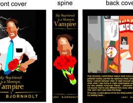
Lexi's book is parody. It starts:
THE SCHOOL CAFETERIA TABLE WAS COLD AND HARD AS polished marble, just like his rapturous chest, which was the first thing I noticed between bites of stale broccoli and salty potato chips while I was trying to make meaningless conversation with my new partially hung-over friends. I perceived immediately, if not sooner, that he was different from every other boy I had ever met%u2026and I don%u2019t just mean the fangs.
Of course, a mere glance at his two sharp pointy teeth stopped my beating heart...- 12 anni fa
-
marATTACKs
- 12 anni fa
Thank you. I hope you wont close the contest early. I will submit entries before the deadline ends :)
- 12 anni fa
-
pivarss
- 12 anni fa
Hello greenjacketbooks, of course you should reject designs that don't quite work for you! In my opinion it's helpful to designers! :)
- 12 anni fa
-
Oniria
- 12 anni fa
please make some comments on number #18
- 12 anni fa
-
Edirochadi
- 12 anni fa
Feedback for #8, please.
- 12 anni fa
-
juls5
- 12 anni fa
can it be a landscape format?
- 12 anni fa
-
Titolare del Concorso - 12 anni fa
Not really, unless you want to include the backcover and spine in the file.
- 12 anni fa
Come iniziare a usare i concorsi
-

Pubblica il tuo concorso Con facilità e in pochi istanti
-

Ottieni una Miriade di Proposte Da tutto il mondo
-

Seleziona la proposta migliore Scarica i file - Facile!