haniputra
Indonesia

Note: Please read ALL instructions below before submitting entries:
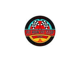
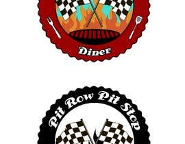
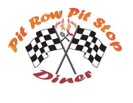
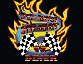
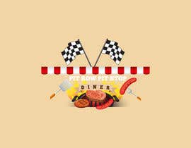
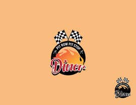
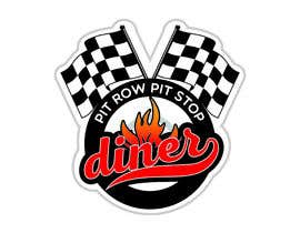
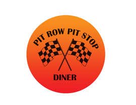
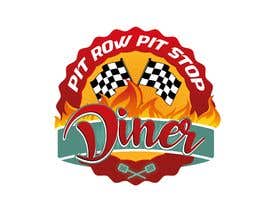
New diner on a budget needs a logo update. Their current logo is bare bones. Please see attached file "pitrowlogo.pdf". They would like to add some color and "flash" that would look good on everything from advertisements to BBQ sauce labels, but could still look good in black and white when they need to advertise in newspapers with limitations. The file needs to be in an editable vector format, preferably Adobe Illustrator or EPS. You can use the existing checkered flags, which have been purchased stock images for this logo or you can create your own. The flags are in the pdf and ai files below. The logo must have two checkered flags crossing as seen in the examples. Please let us know what fonts you have used for this project in the entry comments. We would prefer fonts from MyFonts.com that can be purchased with all rights or open source fonts.
They would like to incorporate the diner colors, which are red, white, black, and turquoise. They would like the name "Pit Row Pit Stop" to stay at the top of the logo as it is now, along an arch, but would like to see it on a banner of some sort, or something that ties the entire logo together. They would also like some fire coming out to emphasize that this is a BBQ restaurant. They would like the word Diner to be beneath the flags.
As you can see from the diner pics, this is a fun, family, retro diner and they would like their logo to illustrate this. Add or embellish from the instructions above. Maybe you've thought of something creative that we haven't... so don't be afraid to go out of the box on this one!
Thanks in advance! We will be looking through all entries on Thursday, Aug 10th and will leave feedback on Friday to guide any changes and let you know what we like/don't like.
Here are some links to the kind of vibrant logos we would like to see. We would like to see this type of creativity on fonts where they have some effects added, and not just plain font. We would also like the black, white, red, and turquoise colors to really pop... and we definitely want fire.
https://mir-s3-cdn-cf.behance.net/project_modules/disp/10826811609017.560fa988e511b.jpg (like the vibrancy and the font work)
http://www.originalhotsaucestore.com/templates/kremlin/i/logo-shadow.png (like the fire and banner)
https://b2b989d215c701ad63d7-288404e13f895703cf2798bf6ae95228.ssl.cf1.rackcdn.com/389853456259-350.png (love the retro font and fire)
https://images-platform.99static.com/uWxXTpTgU2I4rlrEC6KX29_Lp_8=/fit-in/900x675/99designs-contests-attachments/47/47429/attachment_47429259 (like that the shape holds everything together, although we don't want a person in the artwork)
https://www.48hourslogo.com/48hourslogo_data/2017/04/05/59960_1491340032.png (love the vibrant gradients and the shape)
https://www.48hourslogo.com/48hourslogo_data/2015/10/10/2015101006030731175.jpg (love the colors and the retro font)
“Haniputra was great to work with. We loved his initial design and asked for a few minor modifications. He responded quickly and made the exact changes we requested. The file was in the vector format we requested (Adobe Illustrator .ai) and the work was extremely professional. We would definitely recommend working with this artist.”
![]() gigsok, United States.
gigsok, United States.


Pubblica il tuo concorso Con facilità e in pochi istanti

Ottieni una Miriade di Proposte Da tutto il mondo

Seleziona la proposta migliore Scarica i file - Facile!