create a company logo

  • Stato: Closed
  • Premio: €150
  • Proposte ricevute: 35
  • Vincitore: creativebooster

Descrizione del concorso

UPDATE:
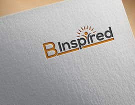
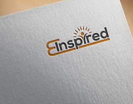
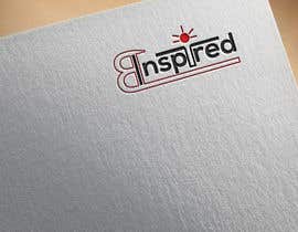
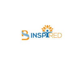
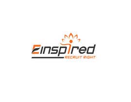
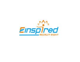
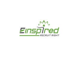
I prefer the B the normal way around, its not that clear its a B and could also be an E to read "einspired"... Could you try it with the B the correct way around? Also, isolating the second I as much as I had originally though makes the end of the word read "red" which is not what I want. maybe it would be an option to highlight just the "arms" and "head"? Thank you for all the great designs so far!
Could I also see some entries with the tag line "Recruit Right."

Please see attached file for my initial idea - subject to the changes posted above.

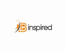
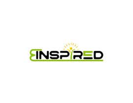
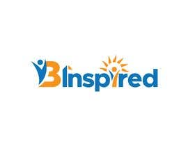
I am starting my own business called B Inspired. The B being a play on my surname which is “Bronsil” and on “Be”

My main activity to start will be a SpeedRecruiting concept, but my idea is to branch out further depending on opportunities.

Rather than be clear in what I “DO” I wanted to transmit me energy and focus on the “message”
My own journey that has led me to starting this activity now started with reading the following unknown quote:
“ I want to inspire people. I want somebody to look at me and think: Because of you I didn’t give up”
When I read it, I knew that was exactly how I felt but it was a tall order! Nevertheless, I feel I have it in me to make it happen.

B Inspired strives to provide people with opportunities they may otherwise never have had, to allow their true selves to shine through and to support them along the way. This can be by encouraging them but very often is also about telling them truths they need to hear but that others may be reluctant to tell them. I firmly believe that if these observations come from a person that is neutral yet that supports them it is accepted and appreciated. So far in my experience this has been true.

Attached is a drawing of the logo as I imagined it (but I’m very open to suggestions)
- The B and the I are in fact one letter symbolising connections
- The bottom of the B/I carries on under the entire word providing support and a solid base (trust and support)
- The second “I” is a person, the arms “protect” the rest of the letters, yet at the same time the open arms are a position of confidence and of trust
- The dot on the same I is the head of the person but also doubles as the sun – it should represent the light that shines, air, breathing, clarity.

I'm considering a tag line of “recruit right” under the logo, but this is not yet something I am entirely convinced about.

Below is a list of words I feel should represent the company and the culture. If possible this is the feeling I would like transmitted by the logo and imaging
- Inspiration
- Creativity
- Flexibility
- Simplicity
- Transparency
- Honesty
- Personality
- Fun
- Quality people

I’m looking forward to seeing the results!

Mandy

Competenze consigliate

Feedback del Datore di Lavoro

“Great to work with and very reactive. He understood the changes I needed to make well and modified small details without a problem until it was right. ”

Immagine del profilo mandybinspired, Switzerland.

Le migliori proposte per questo concorso

Visualizza altre proposte

Bacheca pubblica per chiarimenti

  • sohan010
    sohan010
    • 5 anni fa

    Please check #385

    • 5 anni fa
  • logorezaulmaster
    logorezaulmaster
    • 5 anni fa

    please can you #sealed the contest so you will be able to receive some unique logo design concepts.. when the entries are visible, designers start coping from one another.. so you will start receive number of variations on same design.. hope you got my point of view here... thanks... #sealed please

    • 5 anni fa
  • ericsatya233
    ericsatya233
    • 5 anni fa

    check #342

    • 5 anni fa
  • ericsatya233
    ericsatya233
    • 5 anni fa

    please check #341

    • 5 anni fa
  • Balasundaram912
    Balasundaram912
    • 5 anni fa

    Please check #340

    • 5 anni fa
  • Architecthabib
    Architecthabib
    • 5 anni fa

    #335

    • 5 anni fa
  • Architecthabib
    Architecthabib
    • 5 anni fa

    #327 #326

    • 5 anni fa
  • stewarddark
    stewarddark
    • 5 anni fa

    Pls take a look

    • 5 anni fa
  • Mostafiz600
    Mostafiz600
    • 5 anni fa

    Hi, Please check my all entries. Thank.

    • 5 anni fa
  • marcosmorales4m
    marcosmorales4m
    • 5 anni fa

    Hello. Check my design #296

    • 5 anni fa
  • touchlogo
    touchlogo
    • 5 anni fa

    Hello,
    Please Check New Design #265 #266
    And I Hope You like this Design

    Thank You.

    • 5 anni fa
  • touchlogo
    touchlogo
    • 5 anni fa

    please check #201

    • 5 anni fa
  • touchlogo
    touchlogo
    • 5 anni fa

    Hello Sir,
    Please Check #201 and #202
    Please let me know if something is missing,
    or need any modify like as COLOR,FONT etc please feel free if you want to discuss something private via chat :)
    I'll be right here waiting for your feedback ^_^
    Thanks!

    • 5 anni fa
  • touchlogo
    touchlogo
    • 5 anni fa

    Hello Sir,
    Please Check #201
    Please let me know if something is missing,
    or need any modify like as COLOR,FONT etc please feel free if you want to discuss something private via chat :)
    I'll be right here waiting for your feedback ^_^
    Thanks!

    • 5 anni fa
  • Logozonek
    Logozonek
    • 5 anni fa

    check #188#

    • 5 anni fa
  • borshamst75
    borshamst75
    • 5 anni fa

    #166,165

    • 5 anni fa
  • mandybinspired
    Titolare del Concorso
    • 5 anni fa

    Please put the B the right way round for the next ones, I definitely prefer it to having it the wrong way around. Thank you for the designs.

    • 5 anni fa
  • yohansrimal
    yohansrimal
    • 5 anni fa

    please check my entries sir. #146 #147

    • 5 anni fa
  • Logozonek
    Logozonek
    • 5 anni fa

    please check#136#137#

    • 5 anni fa
  • alalkhanfl93
    alalkhanfl93
    • 5 anni fa

    Hello Sir, Please check my designs #127 #128 Thank you sir

    • 5 anni fa
  • Synthia1987
    Synthia1987
    • 5 anni fa

    #120

    • 5 anni fa
  • borshamst75
    borshamst75
    • 5 anni fa

    #108

    • 5 anni fa
  • esantadesigner
    esantadesigner
    • 5 anni fa

    check please #90#91#92 Entry.

    • 5 anni fa
  • mandybinspired
    Titolare del Concorso
    • 5 anni fa

    Im starting to think I might prefer the B the normal way around, its not that clear its a B and could also be an E to read "einspired"... Could you try it with the B the correct way around? Also, isolating the I as much as I had originally though makes the end of the word read "red" which is not really what I want either. maybe it would be an option to highlight just the "arms" and "head"? Thank you for all the great designs so far!

    • 5 anni fa
  • mandybinspired
    Titolare del Concorso
    • 5 anni fa

    Hi everybody,

    • 5 anni fa
  • SabreToothVision
    SabreToothVision
    • 5 anni fa

    Hi Mandy. Working on this now. Do you have a preference on colour?

    • 5 anni fa
    1. mandybinspired
      Titolare del Concorso
      • 5 anni fa

      Hi Michael,

      • 5 anni fa
    2. mandybinspired
      Titolare del Concorso
      • 5 anni fa

      Sorry for the late reply, I like orange as its quite energetic and positive

      • 5 anni fa
  • scarza
    scarza
    • 5 anni fa

    No attached files. Thanks!

    • 5 anni fa

Mostra altri commenti

Come iniziare a usare i concorsi

  • Pubblica il tuo concorso

    Pubblica il tuo concorso Con facilità e in pochi istanti

  • Ottieni tante proposte

    Ottieni una Miriade di Proposte Da tutto il mondo

  • Seleziona la proposta migliore

    Seleziona la proposta migliore Scarica i file - Facile!

Pubblica subito un concorso o unisciti a noi oggi stesso!